
In Day 2’s newsletter, “Quality Triangle of Startup Branding,” I advise startups to identify brand personalities that can speak to their audiences and then choose a legible typeface that expresses the personalities. I have since launched a workshop kit to help startups identify the brand personalities in 60mins in three fun steps. I am currently classifying typefaces based on brand personalities.
The tech part is relatively simple; I used Retool to build a backend that can read and write into a firebase database. Let me know if you are interested to see a review of Retool as a #NoCode tool.

The process of curating typefaces that express each brand’s personality is the meat of the work. My cofounder Hua has a more in-depth newsletter about font discovery and how to use them for branding and marketing. In her writing, she covers why certain typefaces are suitable for specific types of brands.
We have summarized a few criteria that we are looking for when classifying typefaces based on brand personalities:
If you find typefaces all look kind of similar to each other, sometimes “identical,” you are not alone. Typefaces are supposed to be that way so that they can be easily recognized as the alphabet.
Fun story, a friend of mine was pulled over by traffic police once. The police asked what her job was, and she said she is a type designer; with the police still confused, she further explained that she designs letters. The police were even more confused and asked, “what do you mean you design letters? All the letters are already designed.”
The police got a point, the overall shapes of the alphabet are established, but there are still endless ways to render them. Type designers’ job is to explore endless possibilities, construct systematic styles to render the alphabet, and package them into typefaces. Each typeface has unique visual characteristics that differentiate them from the others; think of it as their “font market fit.”
The visual characteristics that I am looking at includes:
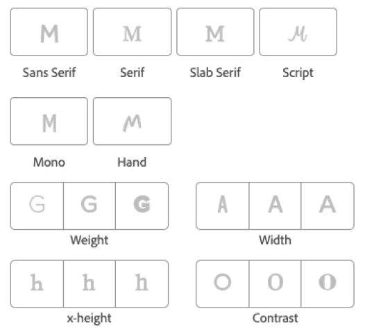
From these characteristics, I can connect the lines like:
The historical background of a typeface style also informs their personality. Garamond, a typeface designed in the 15th century, carries legacy and heritage. Therefore it is suitable for universities, law firms, financial institutions, and companies identified with “Classic” brand personality. If you want to learn more about Garamond, Hua wrote an article about it.
The historical background factor is very intertwined with the visual characteristics factor; we may associate certain personalities to visual characteristics because of when the visual styles were invented. Foods for thoughts today: if Serif font was created in the 20th century and Sans Serif in the 15th, will we have different views on them? Would “Sans Serif” conveys classy and heritage, and “Serif” conveys modern and freshness? Let me know in the comments what you think!